By Sophie Zeigler
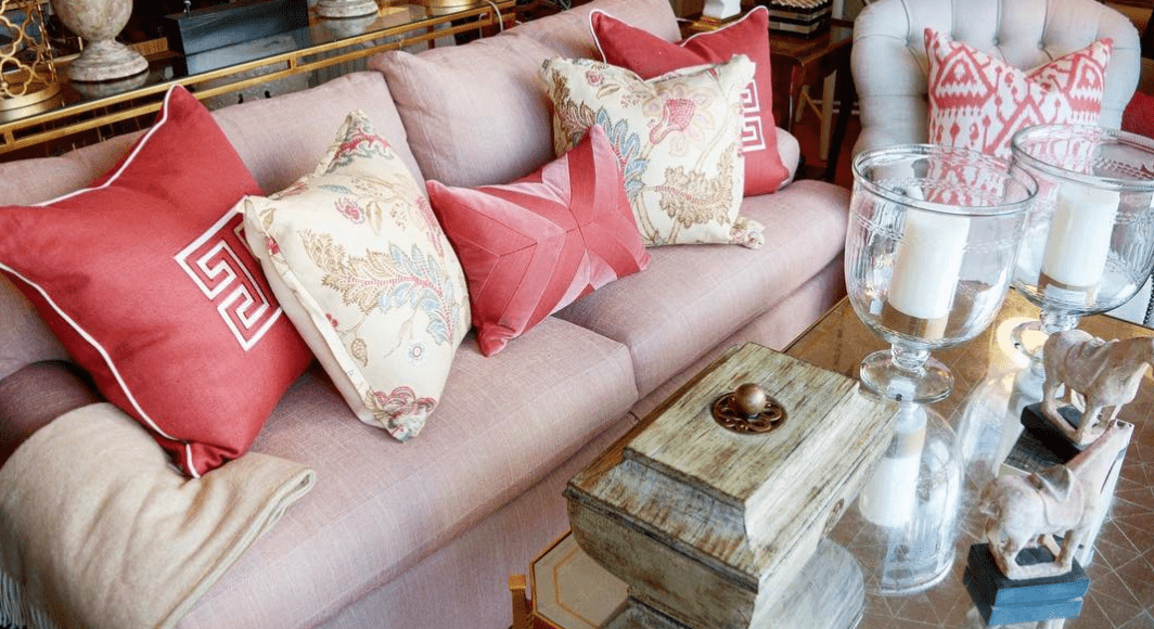
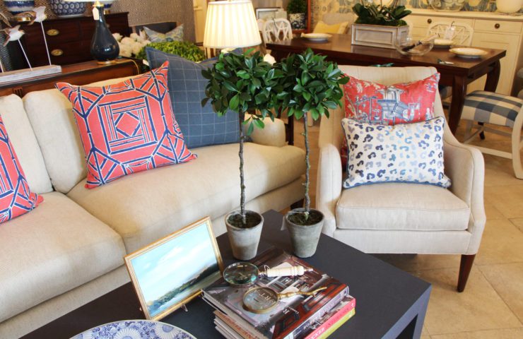
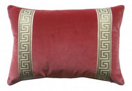
Pantone, the self-described standard for color communication, named ‘Living Coral’ as 2019’s color of the year. Coral is a color we have used in our in-store vignettes and client homes for years, and we are happy to see it finally getting the recognition it deserves.
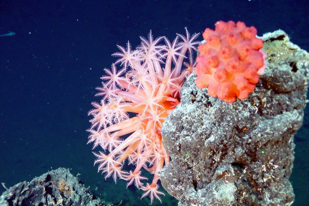
Living Coral is an animating and life-affirming hue with a golden undertone that energizes and enlivens with a softer edge. Sociable and spirited, the engaging nature of the color coral welcomes and encourages lighthearted activity and playful expression.

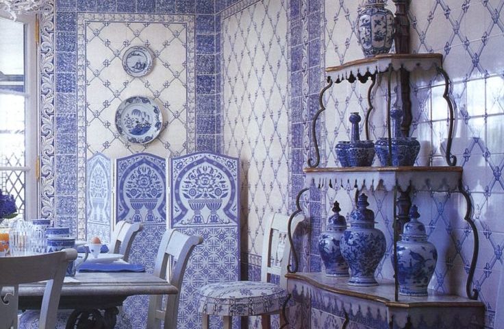
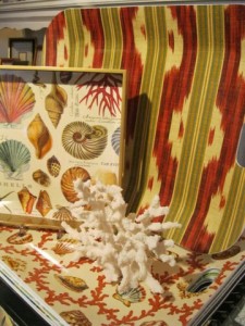
Images courtesy Victoria & Albert Museum.
Coral was used as far back in time as the ancient Egyptians. During this time, it was harvested from the Red Sea. While not much is known about coral in these ancient times – it either wasn’t very popular or it was hard to come by – many speculate that it represented warm solar elements. After the Napoleonic wars ended in 1815, coral was then harvested from Naples, Italy, and became very popular in Europe. It was often seen in everything from brooches and rings to picture frames and crowns in the 1800s.
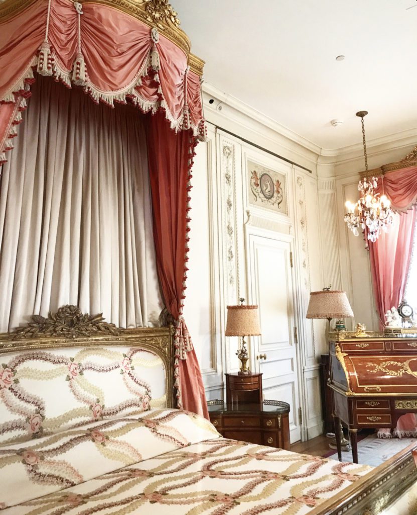
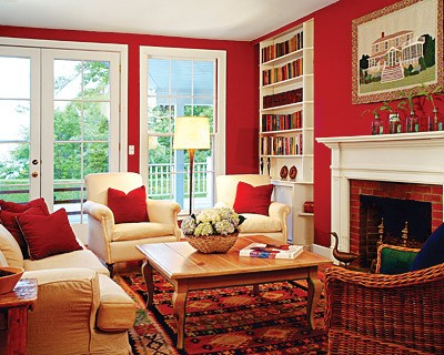
Coral in home décor began to pop up during this time as well, and continues to be a popular color today as it tends to be a softer on the eyes than red or orange, and it’s a more gender-neutral option than classic pinks.
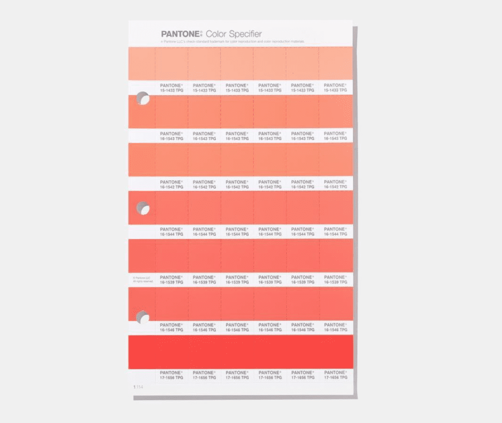
Coral has a few names and shades we like to use: salmon, shrimp, burnt peach, punch, watermelon, flamingo, persimmon, papaya, and poppy. While Pantone officially selected exactly one shade for the year 2019 (as they do every year), we say play with all the shades of coral to find the happy combination you’re seeking for your home.
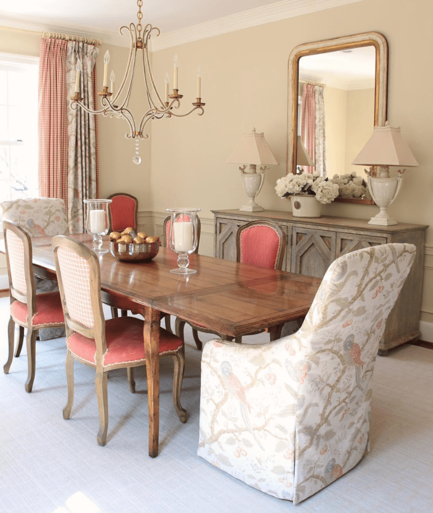
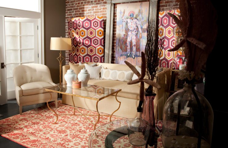
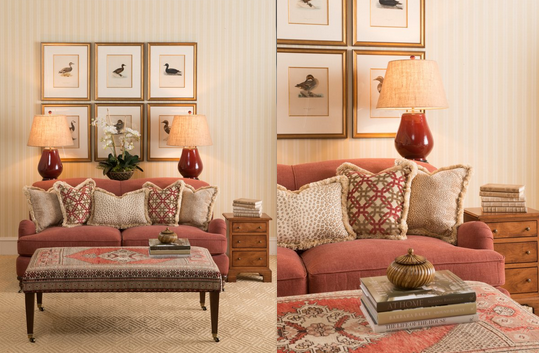
There are no rules when it comes to decorating with coral. With that said, we generally like to let coral stand on its own against neutral tones like grey, dune, khaki, white, gold and silver.

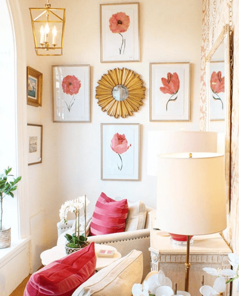
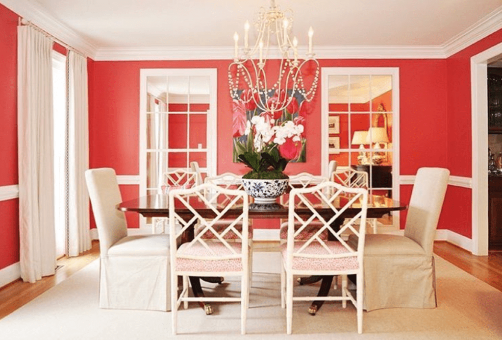
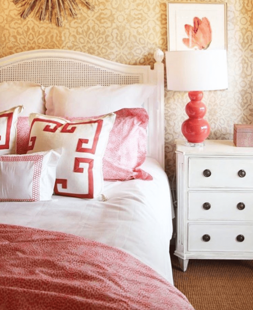
We can’t wait to see who adds more coral to their homes in 2019. If you find yourself adding coral pieces to your home from The Kellogg Collection, please tag us on Instagram so we can see it.
