
Living with color does not mean simply painting the walls red or green. Carefully orchestrated colors in the hands of a skilled designer can speak volumes to you. The trick with color is to select a shade that won’t become tired. This is why so often designers pick a neutral palette. From linens and browns to silver and gray, a monochromatic scheme can give a sense of tranquility that is stylish.

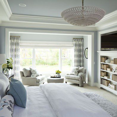
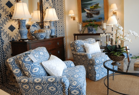
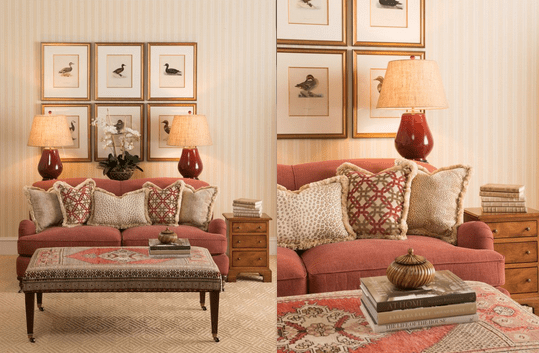
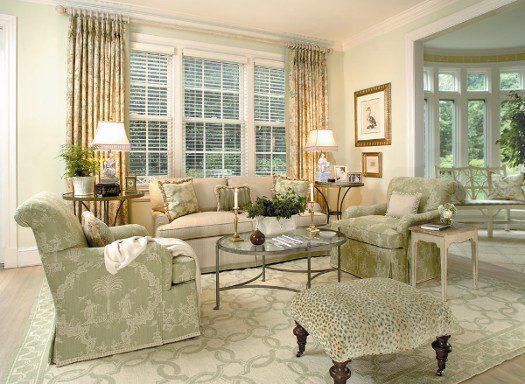
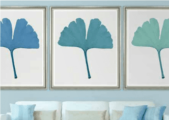
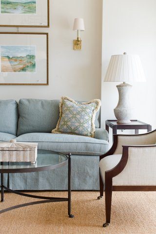
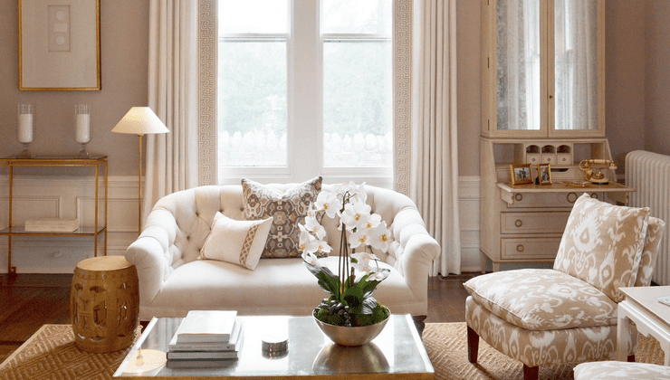
Afterall bolder color, when tempered by a layering of varied textures and balance of organic and architectural design, creates a timeless expression of refined taste. This is personified in the cream and beige living room above, that boast pops of aqua.
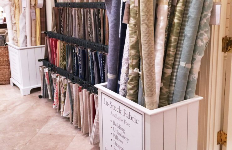
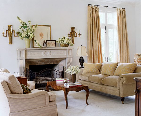
The variations in color options here can be daunting. Not all whites are created equal! Using beiges, greys, whites and cremes that compliment each other is vital.

In an all-white room, collected wares take center stage. It shifts the focus to the silhouettes rather than a play of colors, and the depth of dark wood antiques or the texture of materials are given room to breath.
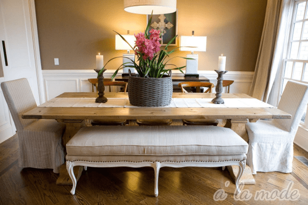
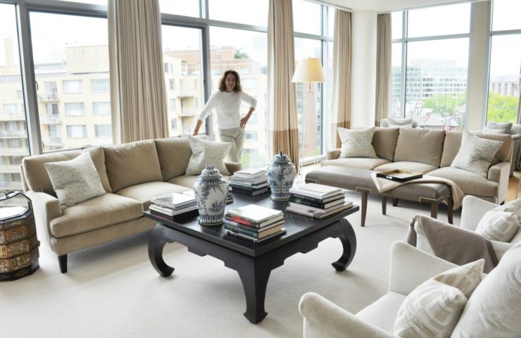
Above, the living room of Frank Randolph’s Georgetown townhouse is a study in whites, with slipcovered upholstery, Jeffersonian antiques mixed with contemporary art, combine to create a visually stunning feast for the eyes. A Frank Randolph dining room is pictured below, and has a similar artistry.


Some tips on neutral pallettes from Frank Randolph via Tone on Tone:
1) Start with a neutral color, and build from there.
2) Pick an accent color that inspires you.
3) Don’t be afraid to mix classical antiques with contemporary art.

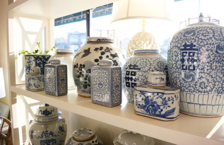
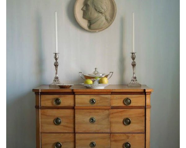
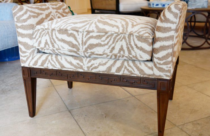
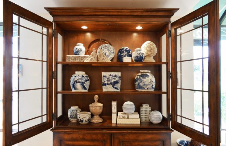
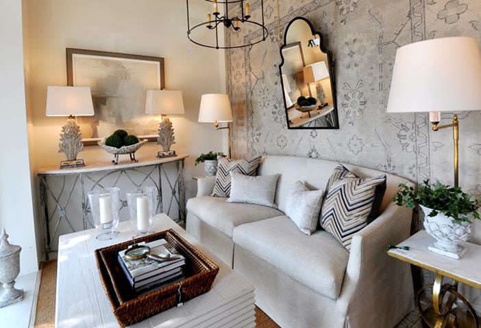
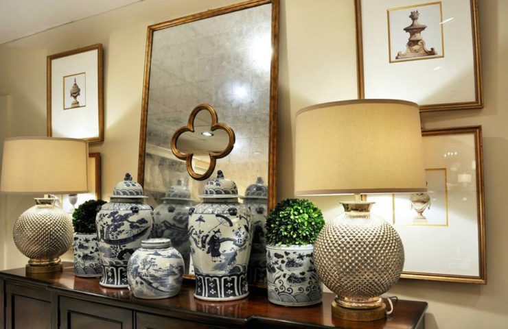
Truth be told, whenever we create a neutral scheme, it is always popular. Above is an example of such a vignette at The Kellogg Collection and the mix of browns, beiges, and cream all go together so nicely. The pop of green from the topiaries is dramatic because it’s the only bold color!

Sticking with neutrals is always chic and sophisticated. But more than that, it’s livable. (Above, a cream tablescape via Ann West Interiors).